
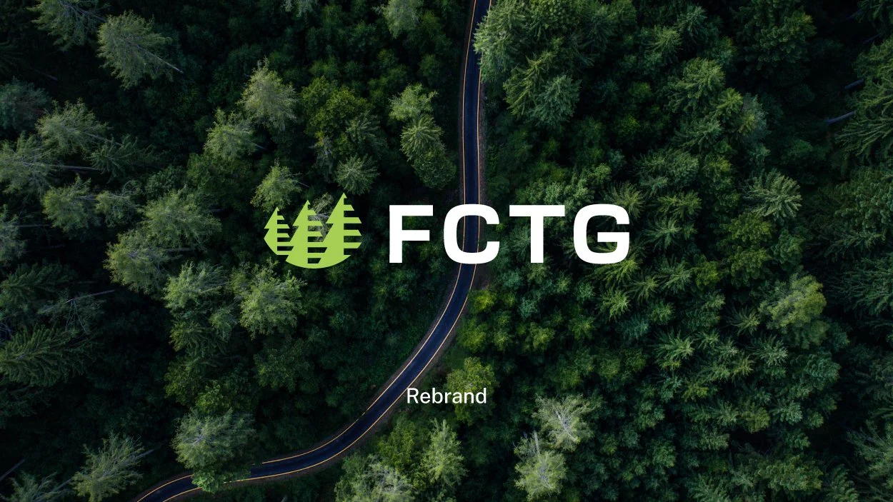

For the last 60 years Forest City Trading Group, FCTG, has been trading building supplies across six continents. FCTG runs 11 subsidiaries throughout North America and they were in need of a contemporary look and feel to represent their business going forward.
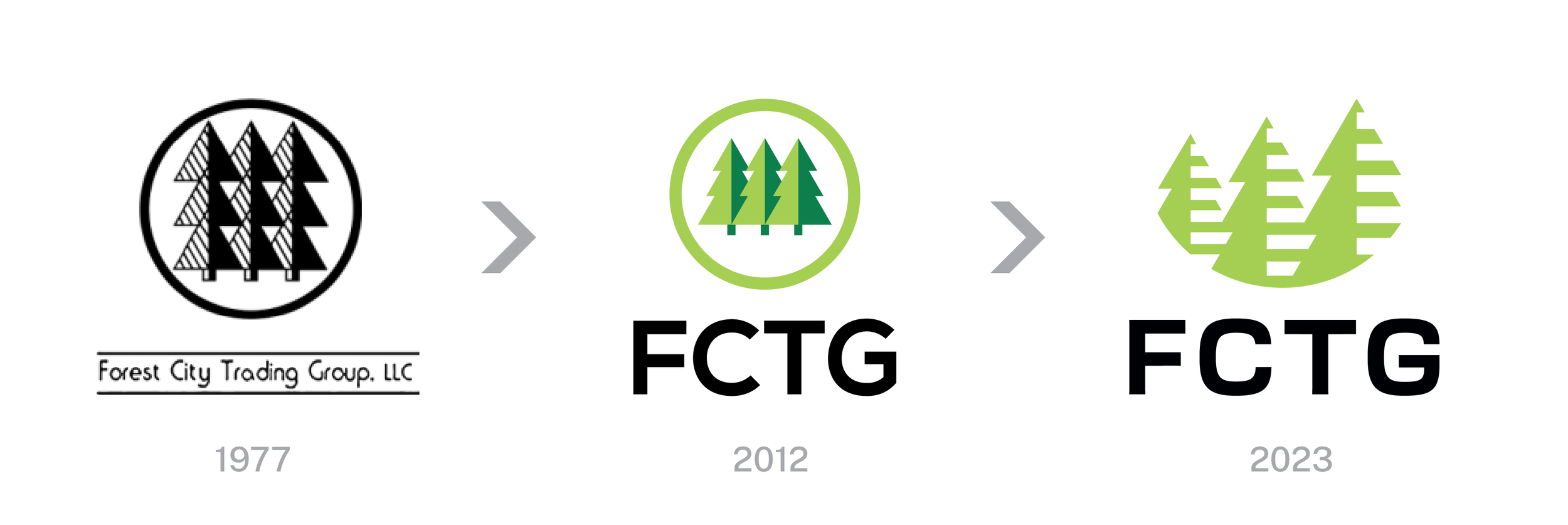
With such a long history it was important to capture the heritage with a logo while maintaining a modern feel ready for the decades ahead. We took DNA from logos past to influence the mark and type we landed on. Maintaining the three trees their partners have recognized for so long but refreshed. Simple trees with horizontal hatching to create a sense of depth accentuated by sitting in a half circle. With the lettering we wanted a bold and strong typeface that works in a tech space, but also in the builders world. The green is bright and eye catching and pairs nicely with either white or black.

Where we landed is very versatile and works in a stacked formation as well as horizontal. It works well in a larger format but also shrinks down very nicely and can be read even at the size of a favicon. From letterhead to signage to video, this logo is a much needed refresh for FCTG to take on the next 60 years and represent the billions of dollars of business they do.


